How might we refresh and expand the hobby brewer platform, BeerSmith, in order to improve the beer brewing experience for both expert and novice brewers?
Overview
Archeologists estimate that the first barley beer was brewed by the Sumerians of ancient Mesopotamia about 5,000 years ago (Andrews, 2014). For many home brewers, gone are the days of recipe calculations on tablets or paper. Modern home-brewers use SaaS based tools like BeerSmith.com to guide them through their brewing experience. Although BeerSmith offers a working solution, there is still much to improve. Many new brewers struggle to pick up the hobby due to the complicated nature of the brewing software. Thus the team sought to re-invent BeerSmith and refresh the software to be more user friendly for new brewers in terms of framework, function, graphic components, and integration with other technologies.
Role
UX Design Lead
Skillset
User Research, Product Design, Prototyping, & Usability Testing
Impact
The refreshed SaaS Homebrewing Ecosystem was designed to satisfy a wide range of user needs, regardless of experience level, providing an accessible and powerful tool for homebrewers. By integrating detailed user requirements analysis, conceptual and detailed design techniques, and usability evaluations, the prototype demonstrated its potential to transform the homebrewing experience. User feedback confirmed the design's effectiveness in addressing diverse brewing challenges and enhancing usability, paving the way for a robust, user-centered solution.
Design Thinking Methodology
Step 1: User Research
The team completed multi-modal user research approach leveraging 4 methodologies: Contextual Interviews, Ethnographical Study, Social Listening, and Cross Industry Competitive Benchmarking. The team then completed a hierarchical task analysis and affinity diagramming exercise to synthesize the four modes into a cohesive understanding of their user’s needs. These needs were then translated into four personas and a user journey map representing their core users, a hierarchical task analysis and affinity diagram.
The 6 contextual interviews comprised of a variety of experience Level: 4 novice hobby brewers, 1 expert industry professional, and 1 expert hobby brewer.
The study resulted in a series of impactful insight statements:
“I don’t really use anything besides the recipe that I get from my local brew shop.”
“It was frustrating at the beginning. When you brew a bad batch and it doesn’t come out good, it’s disheartening.”
“It all boils— pun-intended— down to precision and consistency.”
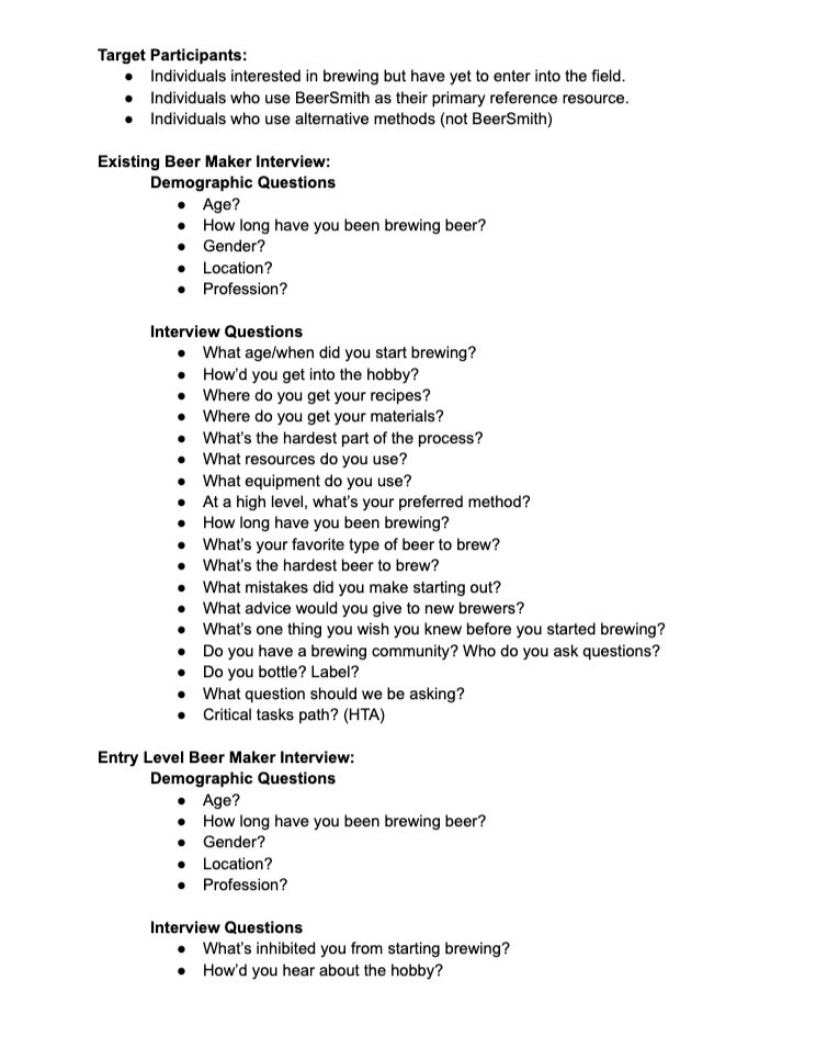
Contextual Interview Script
A study script was authored to standardize the execution of the interviews.
For the ethnographic field study, the team visited home brew hobby stores in the Grand Rapids, Michigan metropolitan area. Copious notes and photos on product distribution, product placement, and customer discussions were taken as the team sought to discover unmet needs from the retailer and customer perspective.
Ethnographic Field Study
Researchers noted the dust gathering on untouched merchandise and steep sales to move stock of brew guides out of the store.
For the social listening study, the team evaluated the AppStore review data of three beer brewing applications: BeerSmith, Brewer’s Friend Legacy, and BrewFather. The data was pulled by executing a simple code in Python 3.9. The team collected 150 reviews per application for a total of 450 data points. The qualitative data was coded and analyzed for themes. The core themes highlighted by the social listening data were:
Data & recipe loss anxiety
Desire for customization & personalization functionality
Desire for consistency in experience & capability between application & website
Desire support through entire process
For the cross-industry competitive benchmarking effort, the team explored existing analogous solutions across the beer, wine, and food industries including Untapped, Brewer’s Friend, Beer Labelizer, Wine Maker’s Academy, Vivino, All Recipes, and DIY Network. The team learned that the industries observed shared many cross-industry tools with regards to things like end-goal, procedural processes, and sense of community. These cross-industry tools consisted of:
Calculation/Tracking
Step-by-step process
Export capabilities
Learning tools
Recipe Recommendation
Step 2: User Research Analysis
The multi-modal methodology enabled the team to create a well defined understanding of the users’ needs. In order to synthesize the various methods of collection, the team completed a hierarchical task analysis, affinity diagramming exercise, high-level user journey map, and personas .
The hierarchical task analysis (HTA) proved to be a useful resource to break down complicated tasks into their core steps. The team broke down the brewing process into four core steps: prepare, brew, ferment, and store.
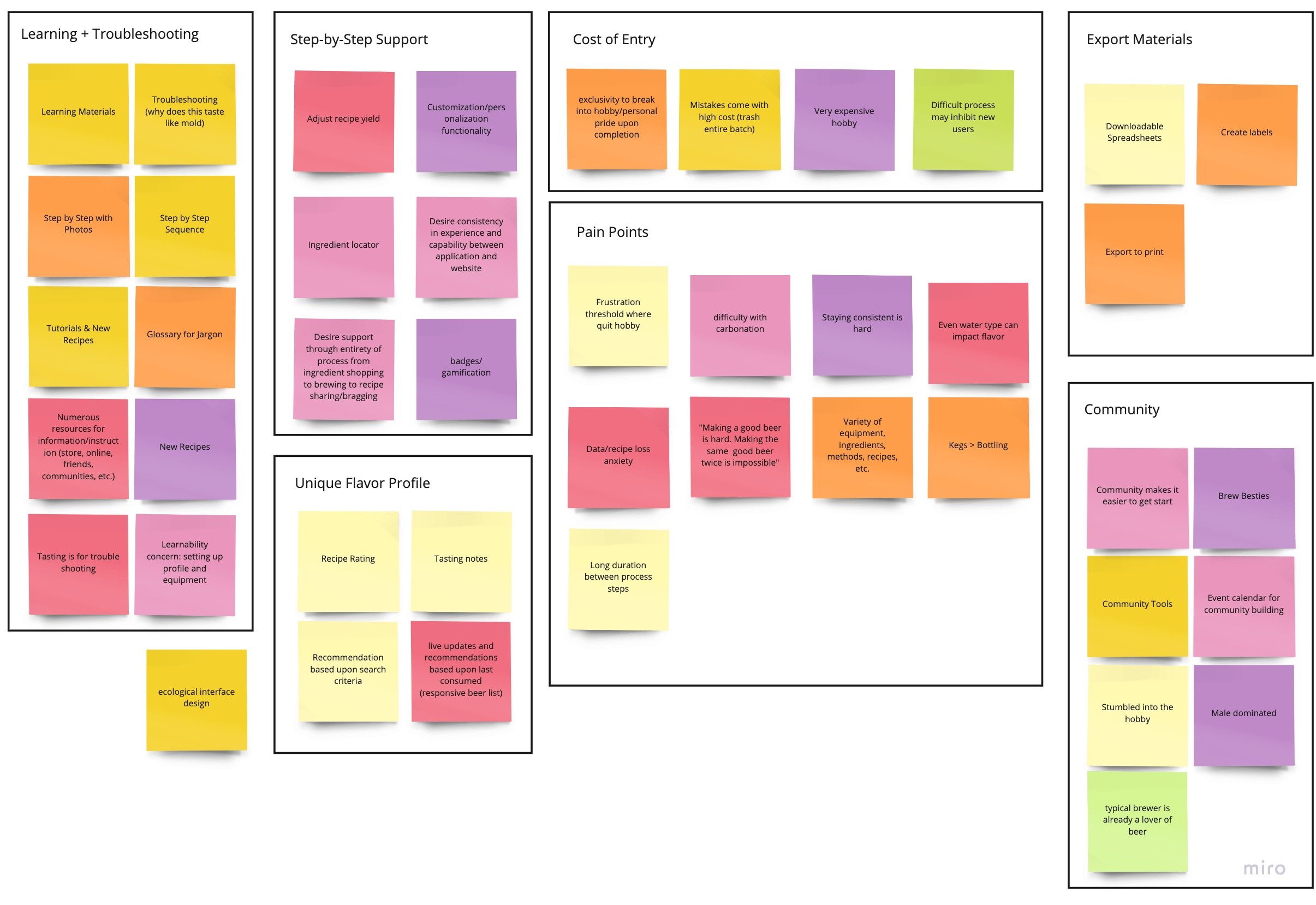
During the affinity mapping exercise, the team placed ideas, stories, and insight statements onto a virtual whiteboard using virtual sticky notes. These were then organized into logical associations and then formally titled with a theme. The core themes created were:
Learning and Troubleshooting
Step-by-Step Support
Unique Flavor Profile
Cost of Entry
Pain Points
Export Materials
Community
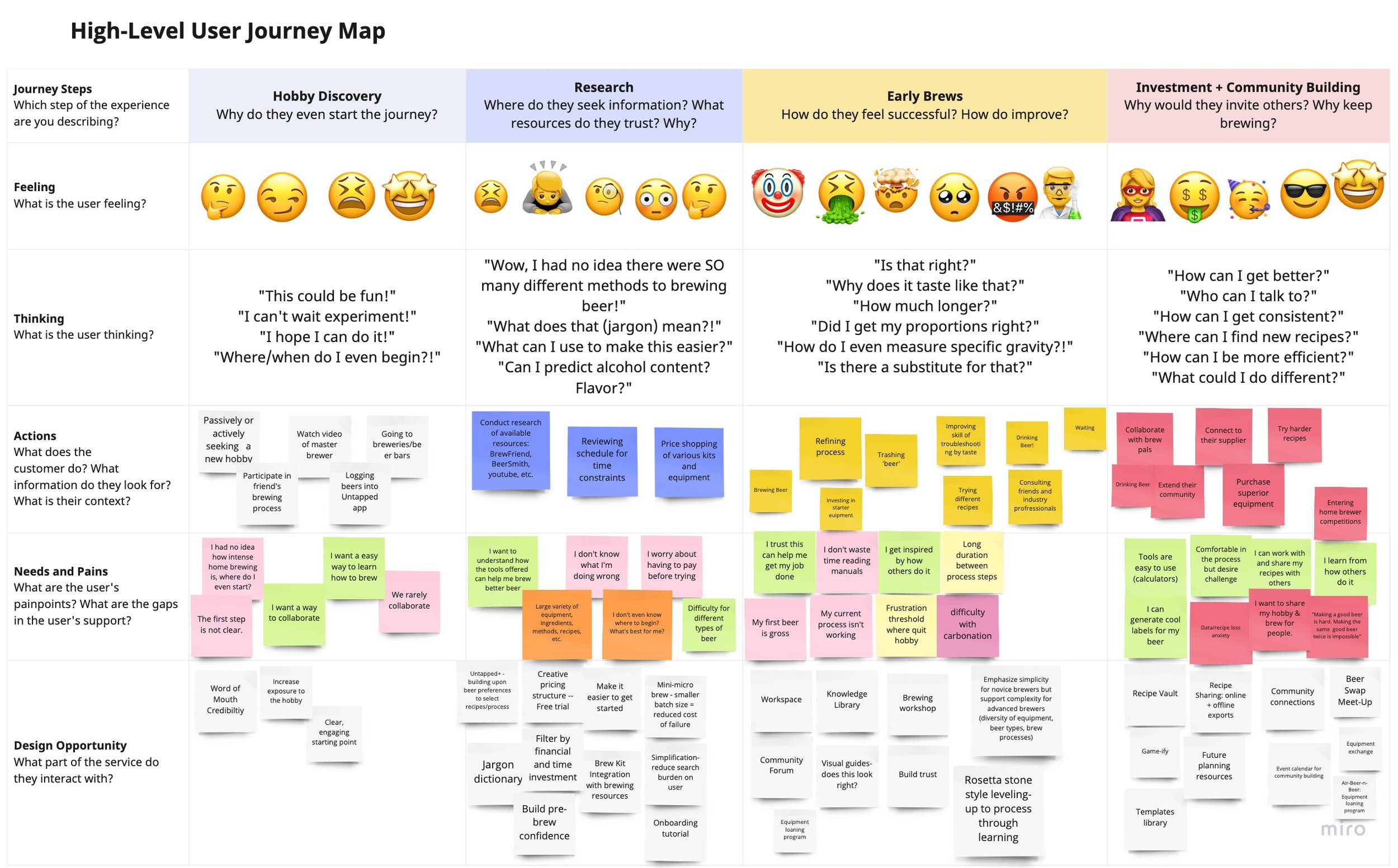
During the User Journey Mapping exercise, the team organized the data collected following the timeline of the user journey: hobby discovery, research, early brews, investment, and community building. The team examined why brewers start the journey of home brewing, where would they go for information and trusted resources, how might they feel successful in their early brews, and how do they fit into the home brewing community or what opportunities lie there.
Multiple user personas were formulated to better understand and capture the essence of the end-users needs and pain points.
Step 3: Ideation
Throughout the ideation phase, the team focused on the user's needs by applying their affinity diagram, user journey map, and user personas. Using these tools as a foundation, each team member developed 8-10 ideas each that they would like to implement into the new BeerSmith ecosystem. Team members then regrouped and performed a “Yes and…” brainstorming session to build upon and generate even more ideas. From there, team members assigned a rating to each idea in the idea book based on a previously agreed upon criteria: benefit to the user, ease of adoption, and creativity or innovation.
Step 4: Conceptual Design
The legacy design had numerous design failures including poor information hierarchy, confusing GUI, only promotes expert use, and has little customizability. The update included numerous changes including enhanced menu navigation, scheduling integrations, mobile integrations, timeline tracker. The update supported several critical tasks such as event discovery, tool finding, brew crew, quick add for recipes, and integration into the resource ecosystem.
The team developed low-fidelity prototypes in the form of conceptual storyboards and wireframe models for 4 conceptual designs. The low-fidelity wireframes were created in figma and consisted of earthy colors and a simple design. Based on personas, affinity diagrams, and conceptual designs the team created user-centric conceptual storyboards.
Step 5: Detailed Design
The initial prototype was improved and iterated upon to produce three high-fidelity prototypes. The first prototype was a total refresh of the current BeerSmith software, which includes the brew process, troubleshooting, tutorials, recipe search, the brew crew feature, and any other process included in the original information hierarchy. This prototype was created in Figma.
Drawing upon previously conducted user research, the team embedded their conceptual storyboards and prototypes into three user storyboards in video format. These storyboards were a series of photographs depicting volunteers as potential users. The first storyboard has a user walking through the process of ordering a brew kit as well as interacting with the website to start a new brew. The second has a user searching for a specific brewing device that they can’t find anywhere in person. They then utilize BeerSmith’s equipment finder feature to locate the equipment they need close by. Lastly, the third storyboard follows many users as they each collaborate with the brew crew. BeerSmith guides these users throughout the entire process and even helps them when they get stuck on a certain step.
Step 6: Usability Study
Usability testing is a crucial step in the human-centered design process. Usability testing brings to light unknown failures of the existing design. The best designs can undergo numerous usability tests and iteration before being brought to the market. Given the limitations of time, the team conducted a multi-model usability evaluation including:
usability study
first click evaluation
heuristic evaluation
accessibility evaluation.
Each method brought to light numerous improvements with the team incorporated into the final design.
Initial impressions of the team’s conceptual design showed that many aspects of the design were successful, but also revealed some flaws. The majority of these shortcomings centered on the graphic display and visual interface.
While first impressions showed opportunity for improvement, task completions were unanimously completed successfully. Participants completed each task with ease and precision and had no trouble navigating the prototype. This was confirmed by the First Click Test results. The percentage of successful first clicks were as follows:
Log-in to software - 100%
Check for notifications - 90%
Start a new brew - 90%
Find a previously saved recipe - 100%
Search for a new recipe - 100%
Check on friend’s progression in software - 80%
See upcoming actions - 90%
See an overview of steps to complete - 100%
During the heuristic evaluation accessibility concerns were raised with the team’s original design. The team then examined the design through the accessibility lens. In doing so, the team identified many areas for improvement, especially with regard to individuals with visual acuities. They ran a contrast check with a desired contrast ratio minimum of 4.5 against our color scheme and quickly learned the visual design was an accessibility failure. This insight was taken into great consideration for the next iteration of the design.
Step 7: Design Iteration
Upon the conclusion of the usability study, the team conducted a color study to determine how they might improve the accessibility while striking the desired tone. The resulting design iteration included improved visual contrast of color palette, hierarchy of information, improved consistency with text and size variation, and improved visibility of system status. The usability study proved an essential step in creating a human-centered design. The team’s emphasis on design-for-all by considering color contrast resulted in a design that would serve a greater population.
Impact
The team set out to refresh the current software ecosystem of BeerSmith.com. We were able to successfully generate a high-fidelity working prototype through the application of the human-centered design process. Through this process, the team continually iterated upon our methods and designs based on the results of testing in order to better understand our user and address those through design enhancements to the software. Through this iterative process, we were able to more accurately test their design as well as their data collection methods. Based on user feedback and usability testing of their final prototype, the team’s refreshed BeerSmith.com Homebrewing Ecosystem would satisfy a wide breadth of user needs, no matter the level of experience of the end user. If fully developed, it would provide users of all backgrounds with an effective and powerful tool to brew their own beer at home. In summary, the process executed consisted of detailed user requirements analysis, conceptual design techniques, detailed design methods, and usability evaluations.


